Streamlit
Streamlit is, according to their website, “the fastest way to build and share data apps”.
I don't know if it is the fastest, but I did go through their “getting started” guide in just a few minutes.
With just a bit of code:
## uber.py

import streamlit as st
import pandas as pd
import numpy as np

DATE_COLUMN = "date/time"
DATA_URL = (
    "https://s3-us-west-2.amazonaws.com/" +
    "streamlit-demo-data/uber-raw-data-sep14.csv.gz"
)

@st.cache
def load_data(nrows):
    data = pd.read_csv(DATA_URL, nrows=nrows)
    data.rename(str.lower, axis="columns", inplace=True)
    data[DATE_COLUMN] = pd.to_datetime(data[DATE_COLUMN])
    return data

st.title("Uber pickups in NYC")

data_load_state = st.text("Loading data...")
data = load_data(1000)
data_load_state.text("Loading data... done! (using cache)")

if st.checkbox("Show raw data"):
    st.subheader("Raw data")
    st.write(data)

st.subheader("Number of pickups by hour")

hist_values = np.histogram(
    data[DATE_COLUMN].dt.hour, bins=24, range=(0,24)
)[0]
st.bar_chart(hist_values)

hour_to_filter = st.slider("hour", 0, 23, 17)  # min, max, default
filtered_data = data[data[DATE_COLUMN].dt.hour == hour_to_filter]
st.subheader(f"Map of all pickups at {hour_to_filter}.")
st.map(filtered_data)
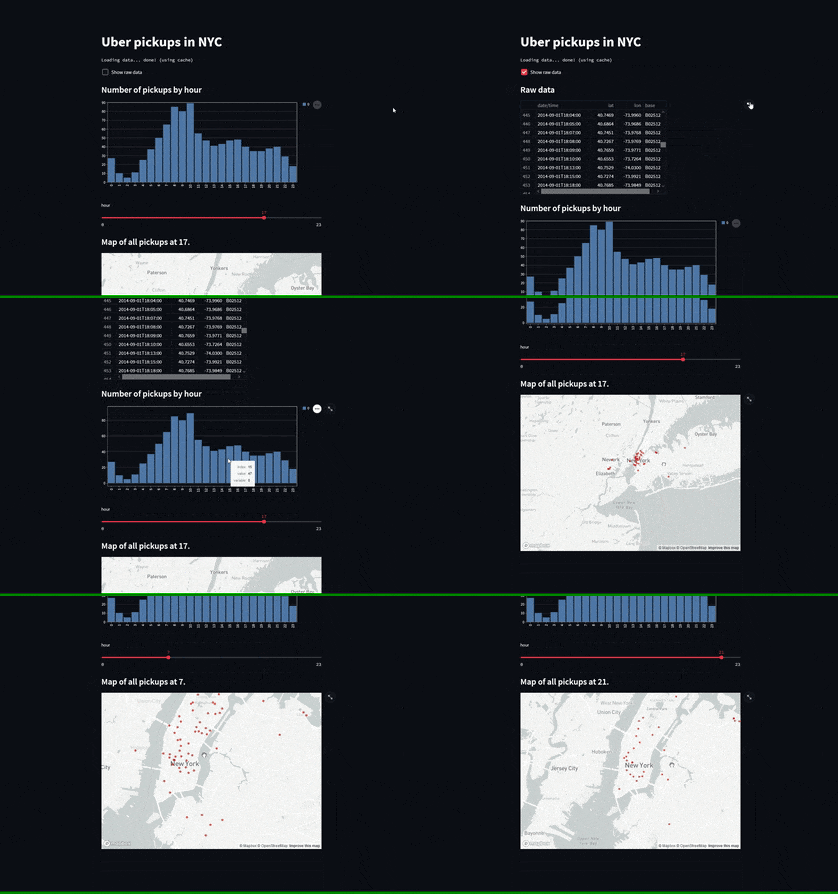
I created a basic web app that loads pickup Uber data from New York City, plots a histogram to show the activity per hour, and lets me plot that data after filtering by the hour of that pickup.
To run the web app, first you need to install streamlit.
This may (or may not) be as simple as
> python -m pip install streamlitIf/when you have streamlit installed, just run the app with
> python -m streamlit run uber.pyThis is more or less what the app looks like:

That's it for now! Stay tuned and I'll see you around!
Become the smartest Python 🐍 developer in the room 🚀
Every Monday, you'll get a Python deep dive that unpacks a topic with analogies, diagrams, and code examples so you can write clearer, faster, and more idiomatic code.
